Brand · Logo guidelines
Logo Guidelines.
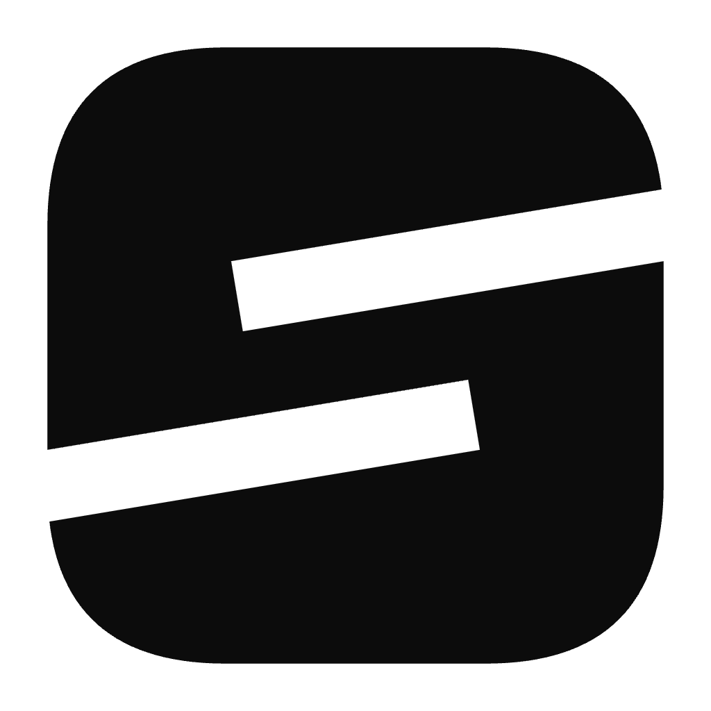
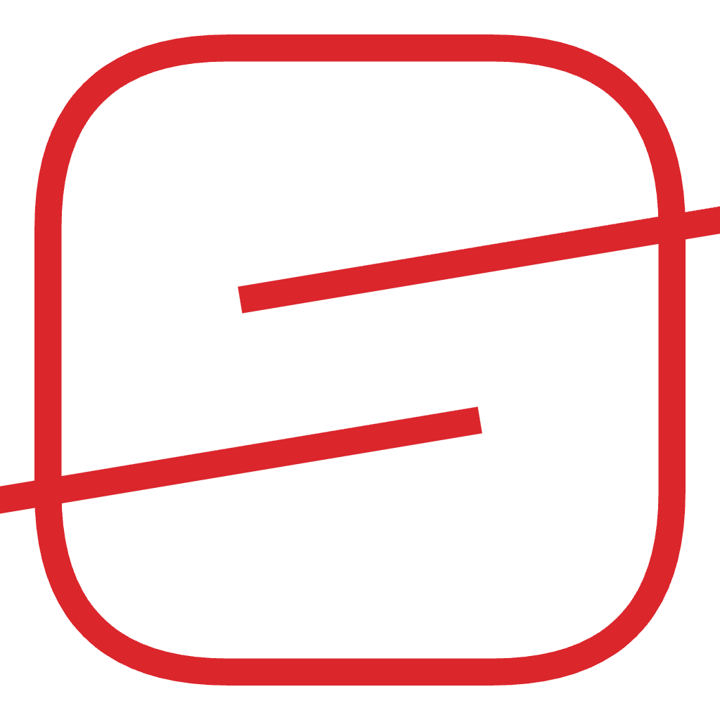
The logo for Set The World On Fire, built on one mark: a solid tile split by two leaning slots into interlocking hooks. Engineered monochrome-first, kinetic by design, and legible from a 16px favicon to a billboard.

Download the logos.
Every approved treatment of the mark, ready to use. SVG scales cleanly to any size for print and web; PNG ships transparent at 1024px and 256px. Grab a single file, or the full set bundled as SVG or PNG.
The mark








Lockups
The mark.
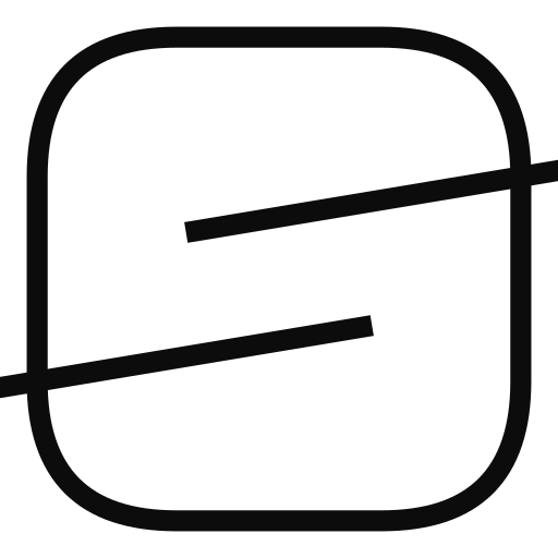
A single solid tile, split by two straight slots cut on a forward diagonal. Where the slots pass, the form leaves two interlocking hooks that read as a positive, near-full S, leaning into motion without giving up any solidity. It needs no second color and already looks like an app icon.
- Tile
- The soft squircle container, a generous 30-unit corner radius that ties the mark to the rounded brand language.
- Upper hook
- Formed by the slot entering from the right; reaches across the top of the field.
- Lower hook
- Mirrors it from the left, clasping shut against the upper hook through the middle.
- Lean
- Both slots tilt on the same forward angle, the single gesture that turns a static S into momentum.
Built on a 120-unit grid.
The mark is drawn on a 120-unit grid. The tile sits on an 8-unit inset with a 30-unit corner radius; the two slots run as parallel axes on a shared forward lean. Rebuild from these guides, never redraw freehand.
Room to breathe. A legible floor.
Protect the mark with breathing room and never let it fall below its legible floor. Clear space on all sides equals X, one quarter of the mark's height. The mark holds its read down to a 16px favicon.
One mark, a tight set of forms.
Use the positive mark by default; reversed on ink, on ember on red, and the line cut only where a hairline treatment is needed. Pair with the wordmark in the locked configurations below.
Six things never to do.
The mark works because its geometry is fixed. Reproduce it only from the master artwork, in an approved color mode. Never do any of the following.
Monochrome-first. One spark.
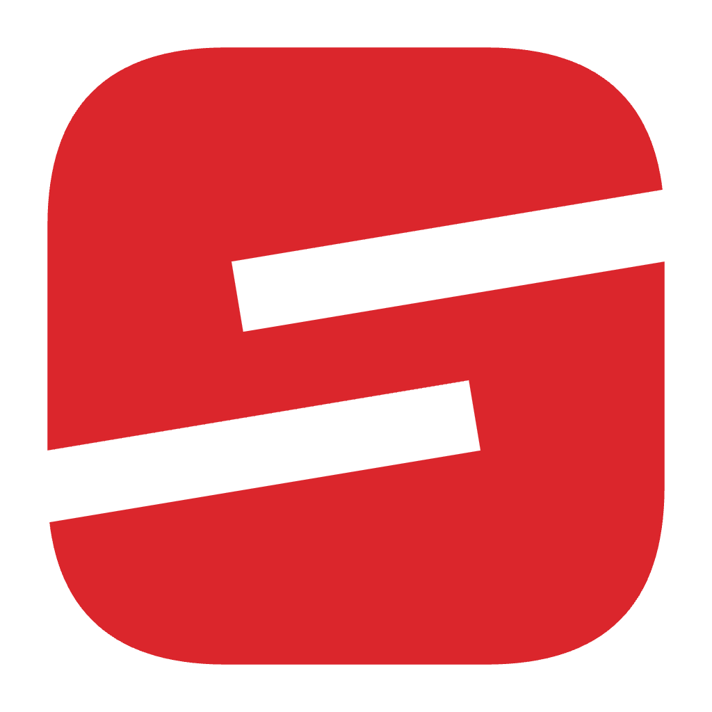
The mark is monochrome-first: it must hold in black and white before any color is applied. These are the only approved colors for the logo. Ember Red is the single accent, used with intent and never as a background wash.
Set in Poppins.
The wordmark and lockups are set in Poppins, a geometric sans whose near-circular forms give the wordmark a confident, rounded weight that echoes the mark's soft tile. Use Bold (700) for the abbreviated STWOF wordmark and SemiBold (600) for the full name.
AaGgSs0123
Poppins's near-circular geometric forms echo the mark's soft, rounded tile.
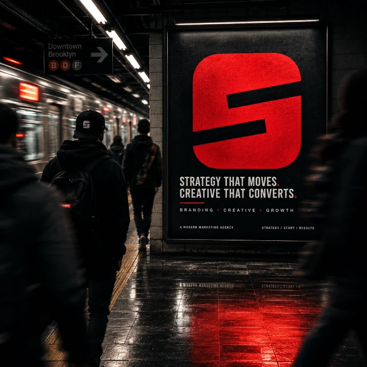
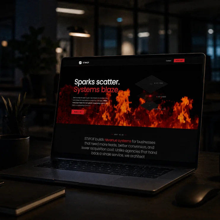
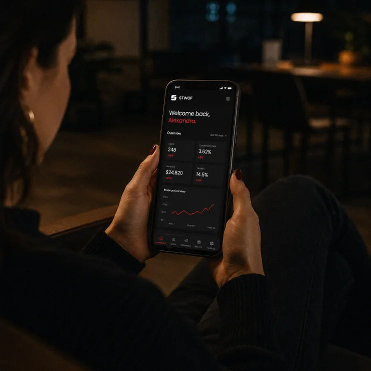
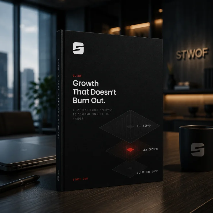
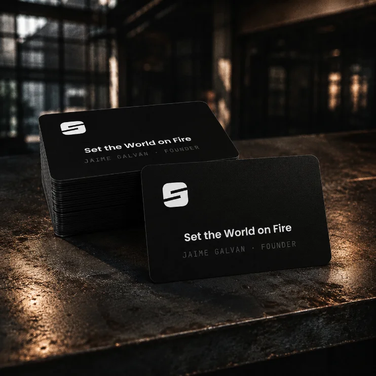
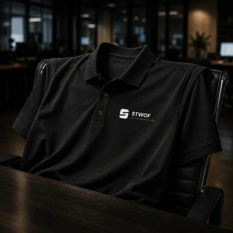
The mark, applied.
The mark is the recognizable unit at small sizes: favicons, avatars, app tiles, stamps. Below, the approved color modes applied across the contexts the logo meets most. All social profiles use the mark as the avatar on an Ember field.